
SendosoGrowing Sendoso.
Research into shipped screens — measured in monthly active use.
b2b gifting · product design
Sendoso is a B2B corporate gifting platform. Companies send Touches — physical gifts, eGifts, and more — to prospects and clients as part of sales and marketing campaigns.
Two people have to make it work: marketers who set budget, build Touches, manage teams, and prove ROI — and senders who use those Touches with their own prospects.
vision
One platform both sides can trust
Managers needed control without babysitting every send. Senders needed confidence without waiting on a creator for every gift. The product had to support marketer-led campaigns and seller judgment in the same system.
challenge
The problem with Touches
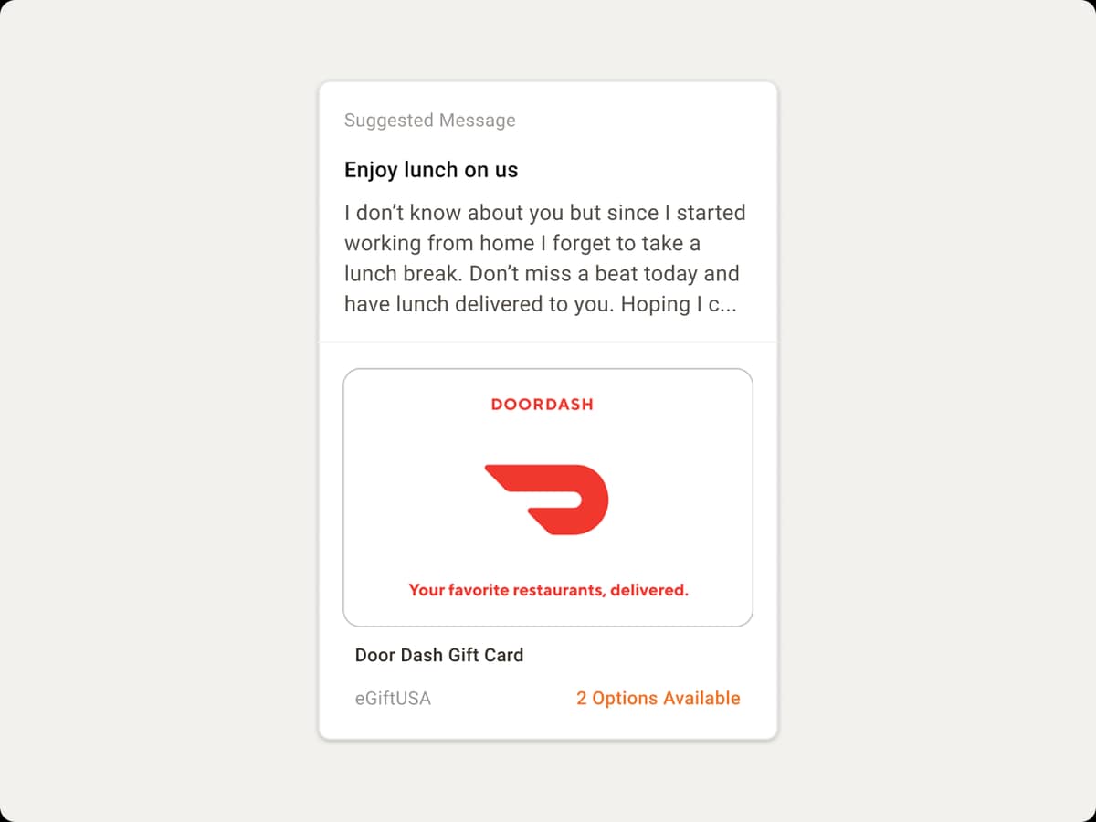
Touches were underused, too numerous to manage, and tough to track once sent. Search in the library wasn’t precise. There was no reliable alert when a new Touch became available. Managers couldn’t see what converted — and didn’t fully trust sales to pick the right gift after past misuse damaged the brand.
the solution
A guided send system — not another pile of campaigns
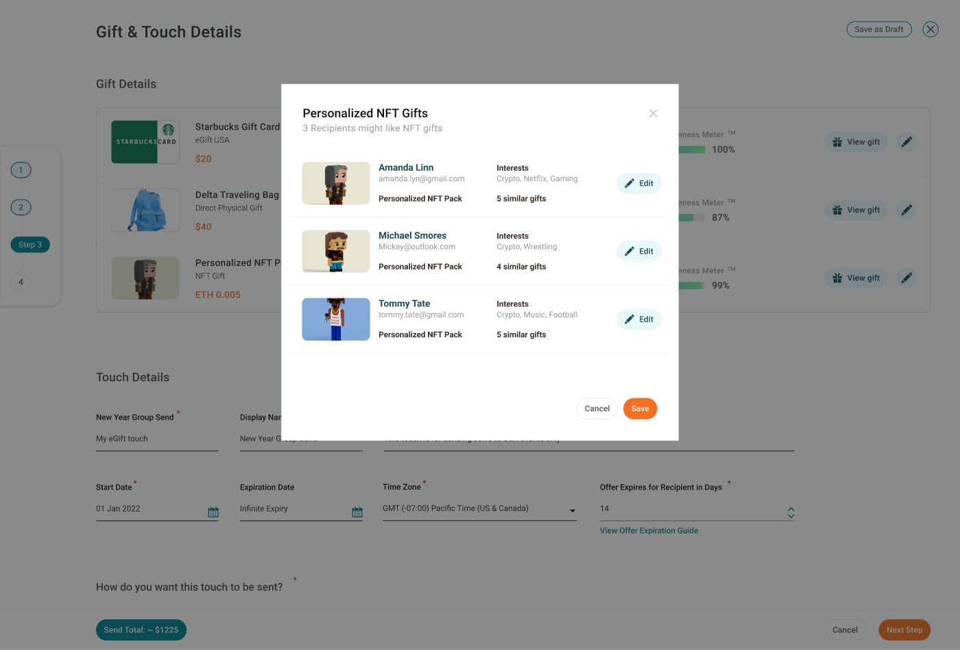
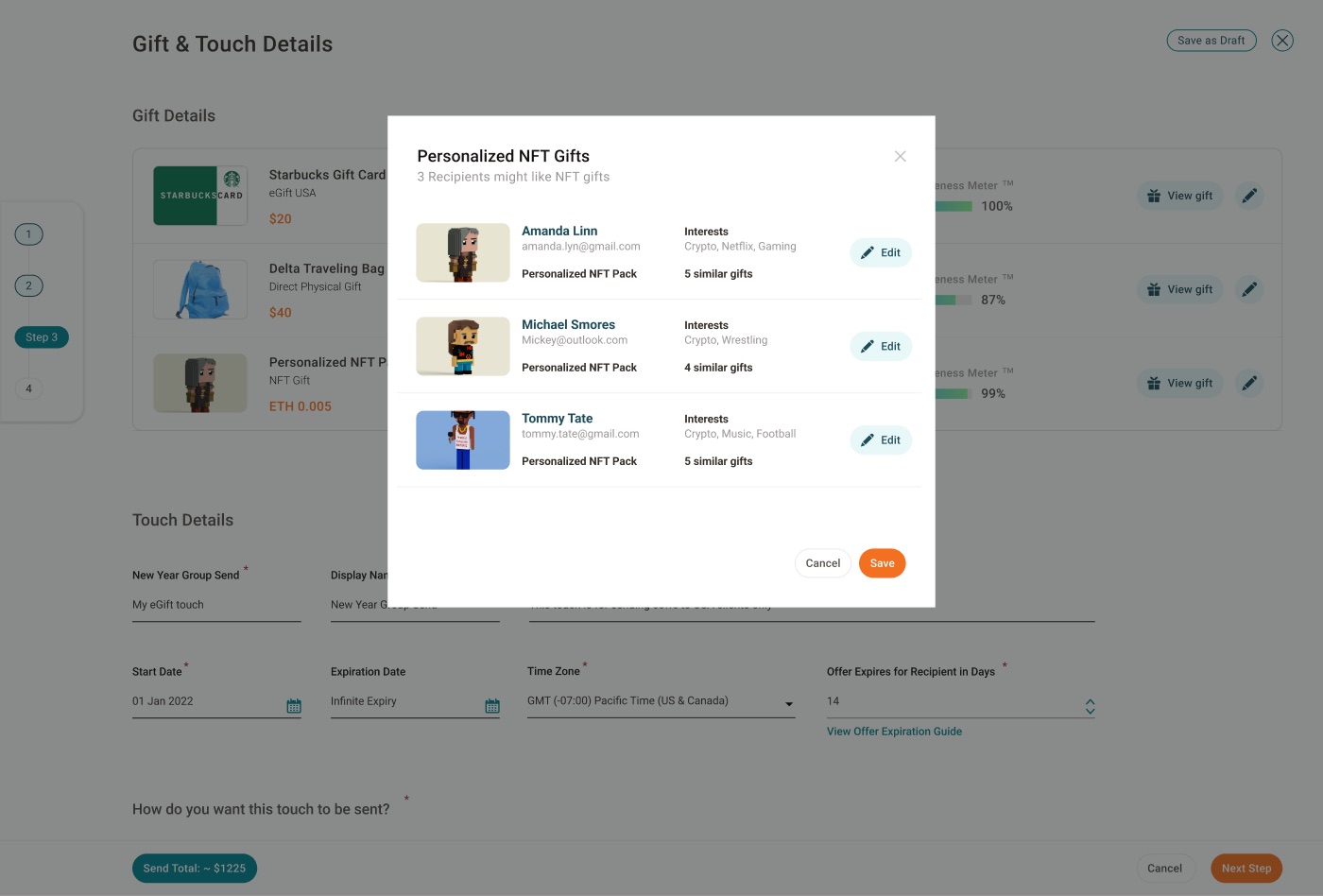
We rebuilt Touch creation into one flow: recipients, gift, billing and source of funds, Salesforce campaign linking, limits, and expiry — with required and optional settings clearly separated.


30%
Increase in monthly active users
1 flow
Guided Touch builder replacing fragmented creation
Shared
Visibility for managers and senders via tracker + alerts
Process
How we worked
Discovery through retro — research first, then screens.
Process
How might we
The questions that shaped the product.
Research
Two users, one messy middle
As a Marketer, you set accounts, roles, budget, and Touches — then measure whether any of it worked. As a sender, you need the right gift for a real prospect without inventing strategy from scratch.
Craft
The Touch builder
We collapsed creation into one guided path: pick recipients (individual or group), assign the gift, set billing and source of funds, link Salesforce, set sending limits and expiry, and write the message — required vs optional called out clearly.


Marketplace
Start from something, not nothing
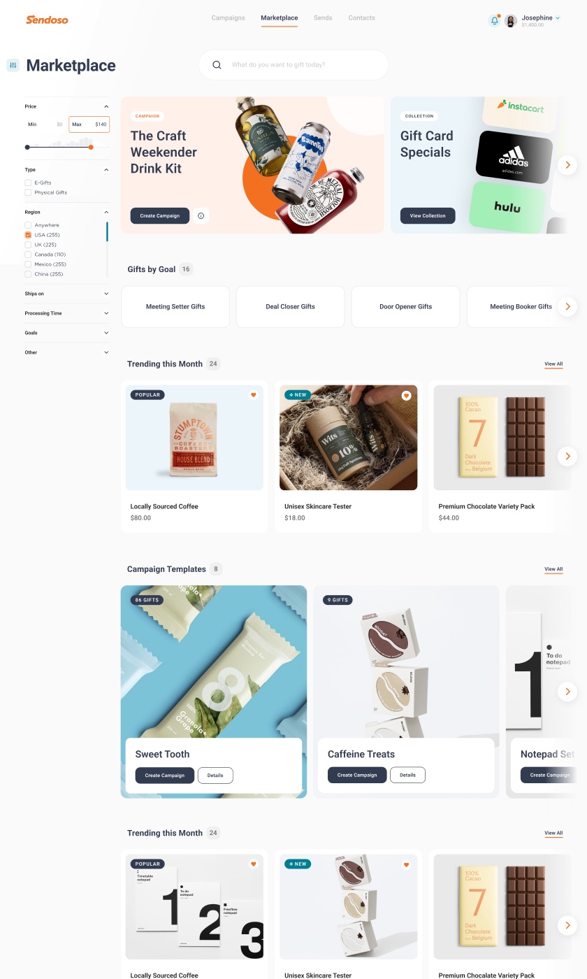
The marketplace home put budget, curated collections, trending picks, campaign templates, and “gifts by goal” in front of senders. Catalog views separated eGifts, physical gifts, and other types with filters by status and price.
Visibility
Tracker and notifications close the loop
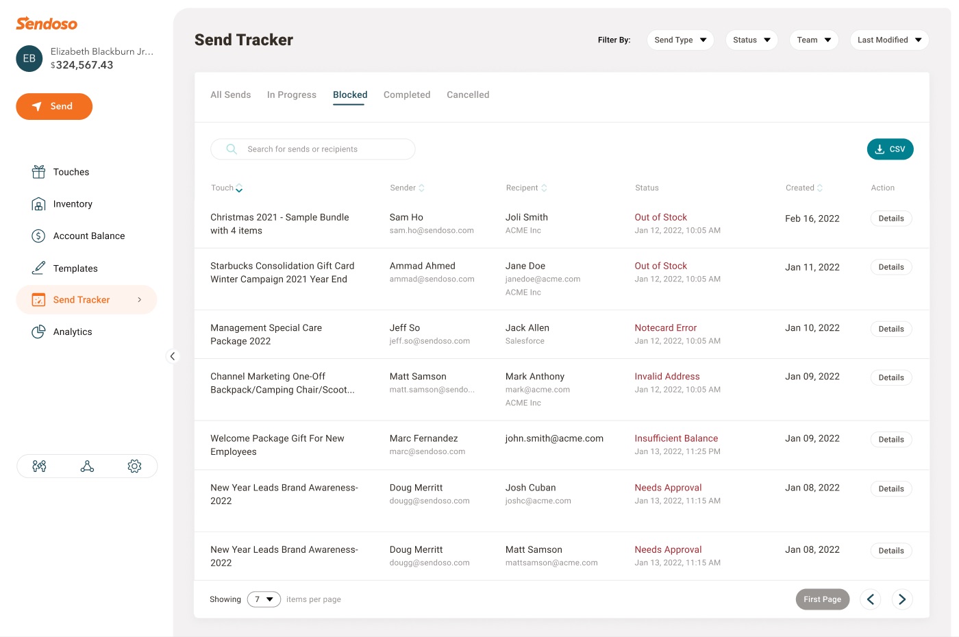
A single send tracker listed recipient, item, amount, status, and date — the shared source of truth research said was missing.
Admin
Teams, branding, and control without micromanaging
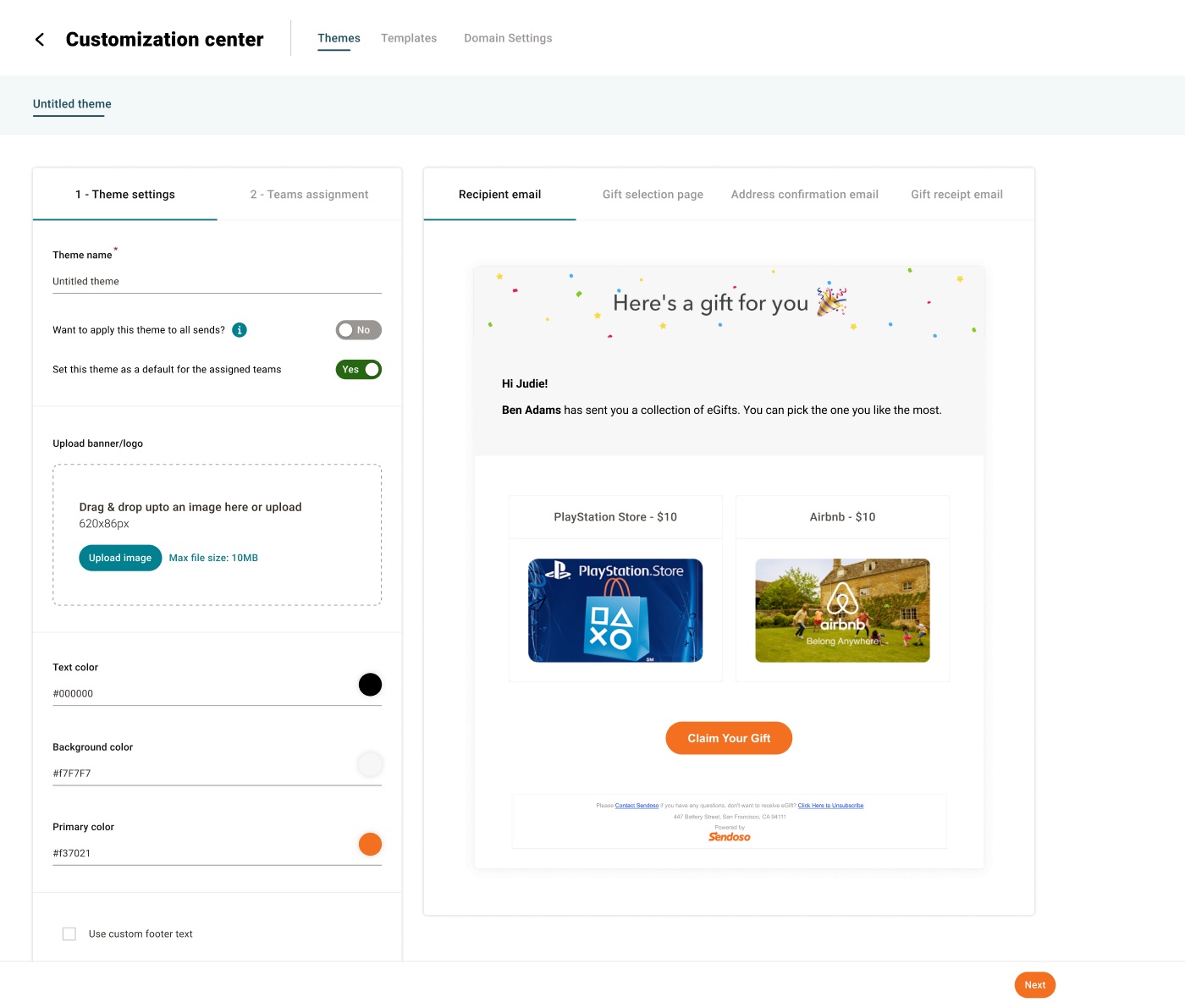
Customization flows covered gift-email branding and team assignment so managers could set defaults once. Roles and permissions stayed part of the same engagement story — standardize the brand and the budget path, then let senders move.
Ship
From research board to release
Screens moved through design review with product and design leadership. The portfolio card for the engagement recorded a 30% lift in monthly active users — the clearest public signal that the platform got easier to use.


Touch builder
Guided flow for recipients, gifts, budget, Salesforce linking, limits, and expiry.
Gift marketplace
Budget, curated picks, filters, and templates so senders don’t start from a blank catalog.
Send tracker
One table for every Touch sent — recipient, amount, status, date.
Teams & branding
Team assignment and gift-email theme settings for consistent, controlled sends.
Takeaways
Trust is a design problem
Manager/sales friction wasn’t only permissions — it was a visibility gap. Shared data beat more micromanagement.
One flow beats five workarounds
People cloned Touches just to change a funding source. Consolidating the builder removed the need for the workaround.
Alerting is part of the product
A Touch nobody knows about might as well not exist. Notifications made new inventory real.
Design for both modes
Some campaigns stay marketer-led. Others need seller judgment. The platform has to hold both.
Outcome
Engagement moved because both sides of the platform finally shared the same story — what to send, who sent it, and what happened next.
+30% MAUs · Touch builder, marketplace, send tracker
“Working with Phoenux brought clarity to key experiences and delivered a noticeable lift in platform engagement.”
Luke Bushner — Product Manager, Sendoso
Services
- Clarity
- Creation
- Discovery